UN LGBTIQ+ Tool
About
The UN LGBTIQ+ Standards Gap Analysis Tool is a joint initiative between UN Global Compact and the United Nations Office of the High Commissioner for Human Rights (UN OHCHR). The Tool is designed to help companies to promote LGBTIQ+ inclusion in the workplace and beyond. The Tool is a free, user-friendly and confidential online platform that helps companies assess current policies, highlight areas for improvement, and identify opportunities to set future corporate goals and targets. The Tool assists businesses to meet their human rights responsibilities and become active agents of change.
Goal
This project focuses on the (re)design of the external landing pages for the UN LGBTIQ+ Standards Gap Analysis Tool. Because the platform is strictly confidential and requires sign-in, one of the challenges is to entice businesses to register and participate. The ultimate objective is to help businesses to take the assessment seamlessly on this website. An intuitive navigation needs to ensure that the returning users can recall the user interface quickly and understand how to use the website on their subsequent visits.
Another standard UN goal is to support non-English speakers. A multilingual platform is an essential requirement to many UN products. Additionally, the website needs to accommodate various abilities by providing well-organized information and clean design.
Branding
The UN Global Compact and the UN OHCHR brands come with certain brand restrictions and guidelines. The UN’s business-friendliness and voice of authority on principles-based approach are the core characteristics of both brands that have to be visually presented in the final website. The human focus is also very important to both brands. All images need to be authentic, non-exploitative and representative of the LGBTIQ+ community without perpetuating stereotypes.
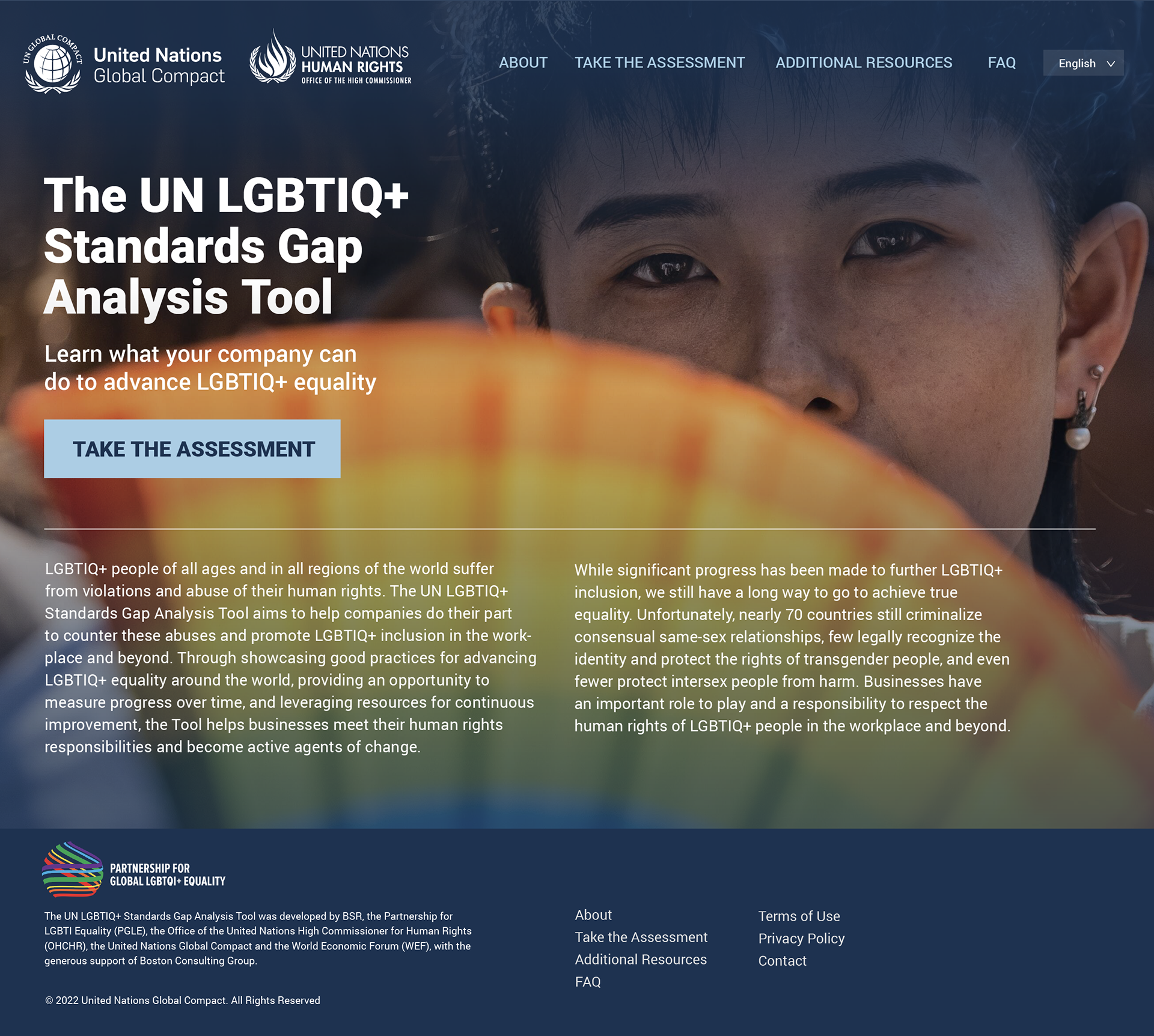
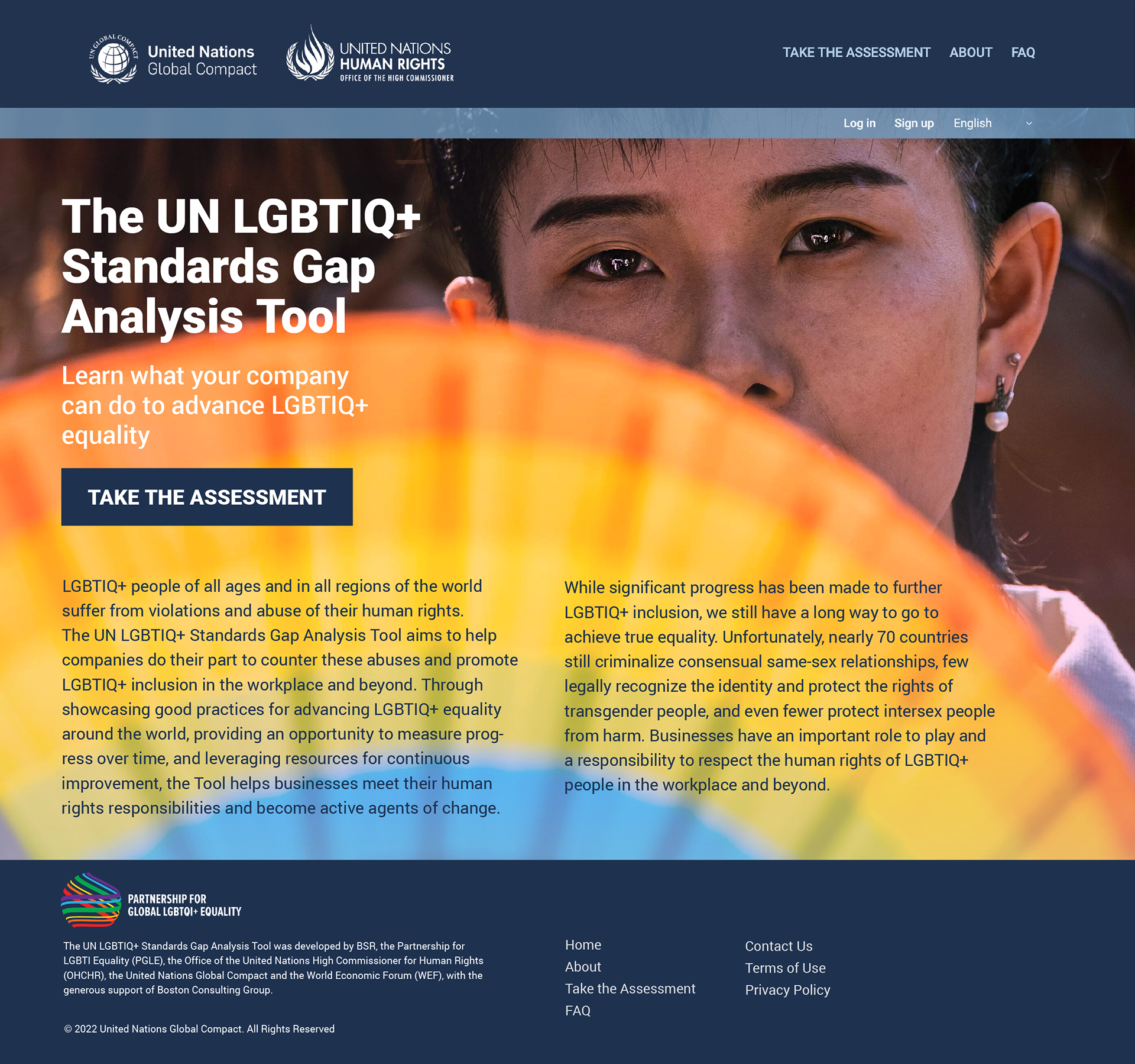
The website design needs to align with the UN branding. From a visual standpoint, the original design needs improvement in the placement and use of various elements to communicate better with target audiences. For example, the imagery needs to represent the LGBTIQ+ community. The same elements and hierarchy should also be presented inside the Tool when users login.
Challenges
When I was asked to take over this project from the consultant, the initial approach was to only address design elements that were not working. But after careful assessment and several consultations, it became clear that the structure had to change as well.
My summary of issues with the initial proposal:
Navigation:
The initial Tool’s landing pages lack proper structure and hierarchy. The first step in this process is to reassess the structure and revamp confusing navigation options. The language option deserves its own secondary menu treatment. The goal is to also think of future navigation, such as a page for additional resources, as this tool continues to grow.
Solutions
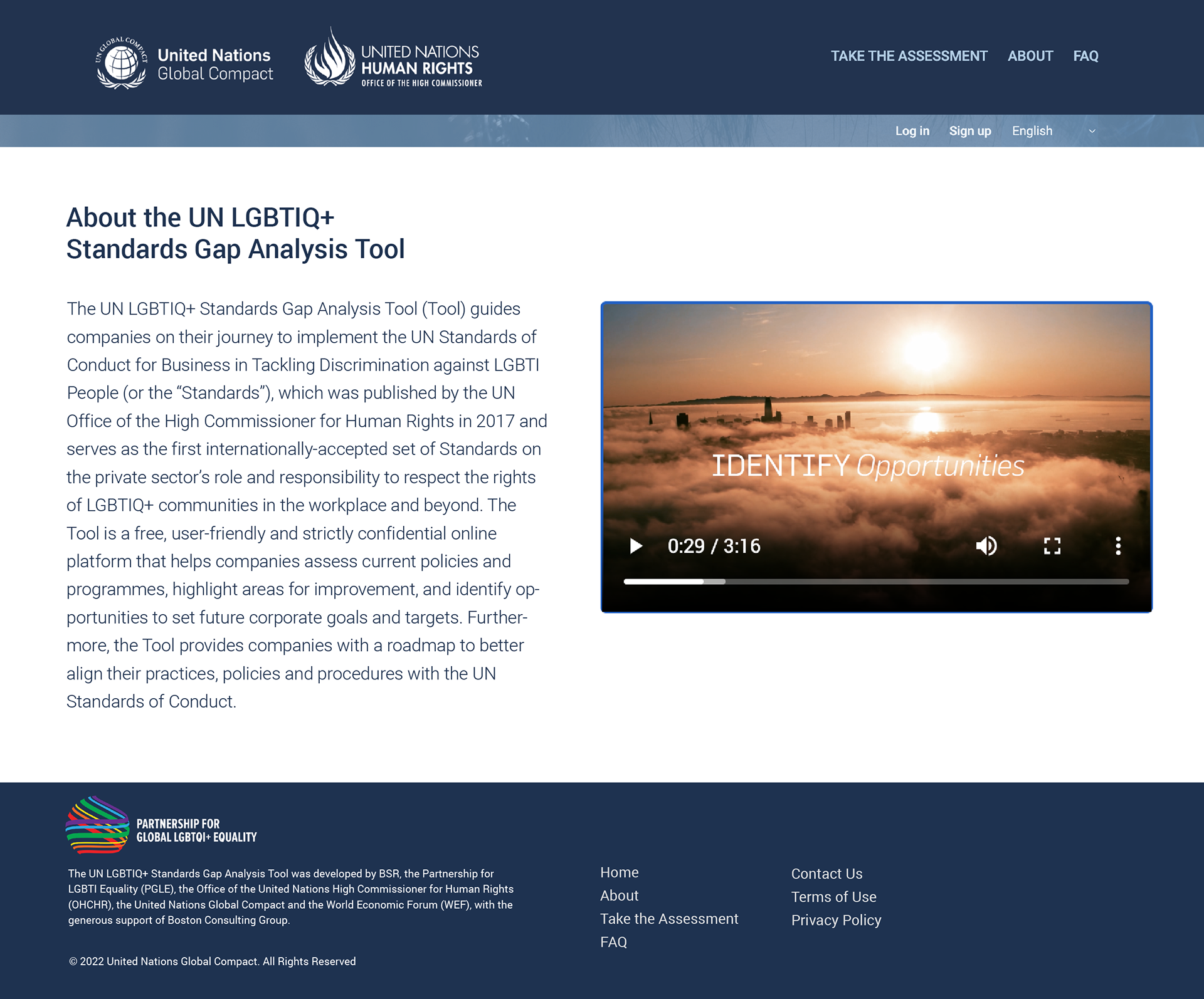
A several mockups are presented to the client from a modern, full-screen photo option to a more traditional look, to emulate the design of other UN microsites. As a result, a combination of traditional and modern look is implemented in a final product. The Tool is still growing its momentum after its successful launch in 2022.


A proposal with a hamburger menu style for mobile:


