UN Business & Human Rights Navigator
Case Study: Responsive Website Redesign
About
The Business & Human Rights Navigator is a guide for companies around the world to better understand and address human rights impacts in their operations and supply chains. Companies can access in-depth analysis of key human right issues, due diligence recommendations, as well as case studies illustrating how businesses have responsibly addressed human rights impacts. The aim of the Navigator is to enhance companies’ understanding of how the UN Guiding Principles on Business and Human Rights can be understood and implemented in practical terms. The Navigator is produced by the United Nations Global Compact in collaboration with the German Government’s Helpdesk on Business and Human Rights and Verisk Maplecroft.
Objectives
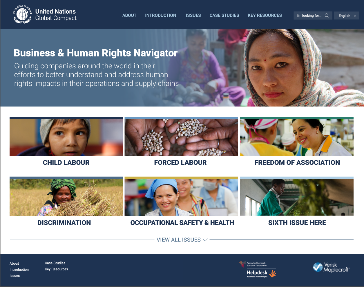
This project focuses on restructuring the website for the Business & Human Rights Navigator. The Navigator aims to help businesses better understand a variety of serious human rights issues such as child labor, discrimination, living wages, indigenous peoples, etc.
1. Because each topic is rich in context, the main challenge is to create the platform where companies can easily locate resources and learn about the issues that are pertinent to their businesses.
2. The content organization should also ensure that users can easily recall the website on their subsequent visits.
3. The ability support non-English speakers is another essential goal of this website. A multilingual platform is a standard requirement to many UN products.
4. Additionally, the website should accommodate various abilities by providing well-organized, accessible information and clean design.
5. The website design needs to align with the United Nations Global Compact branding. Powerful real images should be used to illustrate each issue, while showcasing diversity and respecting the photo subjects.
Summary of issues with the initial website:
Challenges
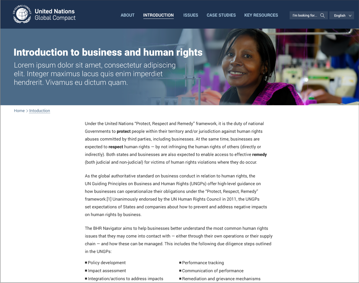
Navigation. The initial Navigator’s menu options are confusing and lack proper hierarchical grouping. The first step in this process is to reassess the website mapping, structure and revamp confusing navigation options. For example, the “case studies” are as contextually important as “key resources”, so they should be put on the same navigational level.
Branding. The UN Global Compact brand is characterized by its business-friendliness and voice of authority on principles-based approach. The authenticity needs to be presented in the final redesigned website, while focusing on a business and corporate audience. From clients’ side, there is a strong need for all images to be real photos from the United Nations photo bank. The images portray real people in their authentic environments, but the final image compilation needs to be representative and must avoid stereotypes. For example, the image taken in the aftermath of a natural disaster cannot be used to illustrate “forced labor” or some other issue.
Initial proposals:


Solutions
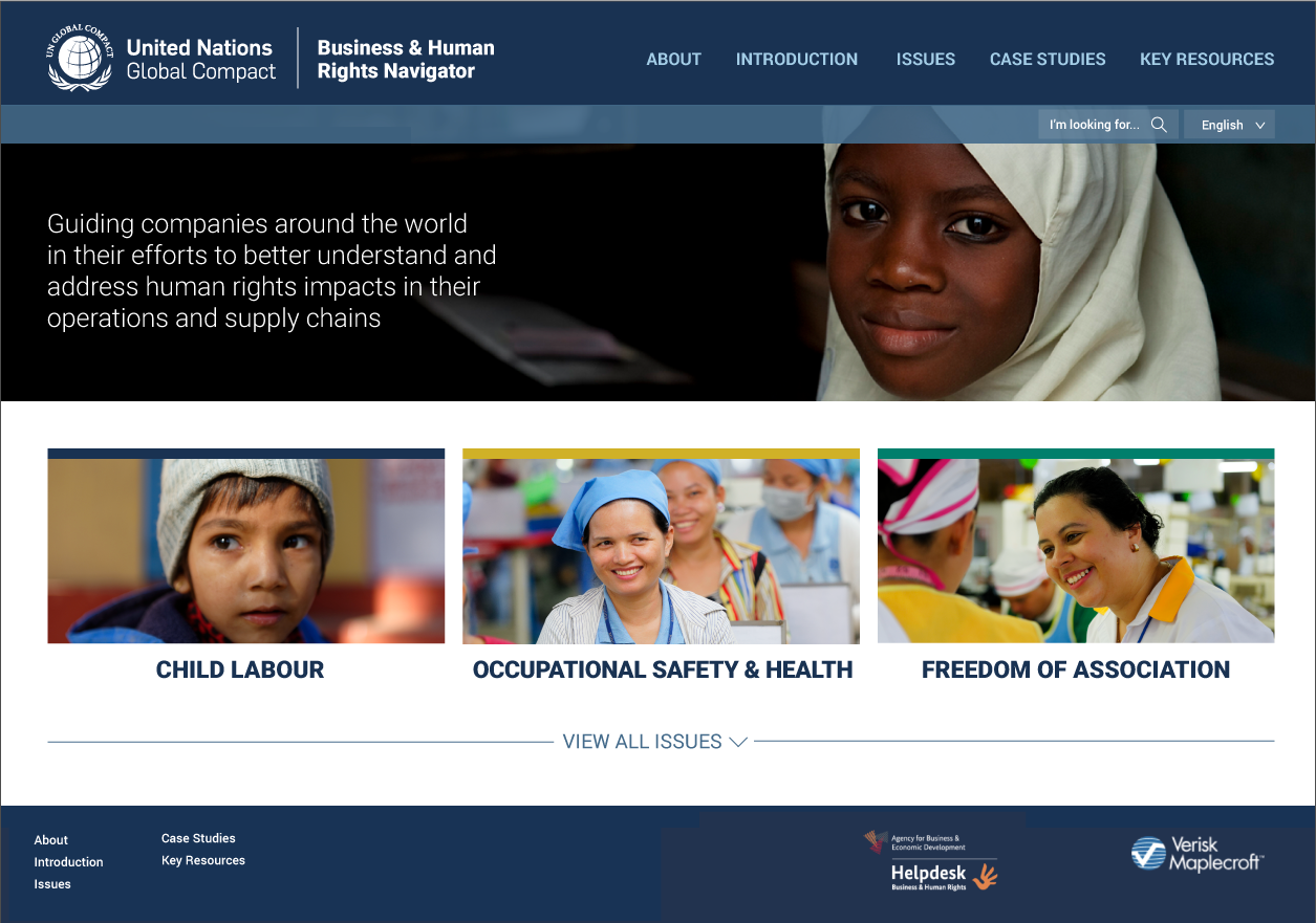
Several mockups are presented to the project collaborators featuring a more classic and structural look, which is aligned with other current UN microsites. The branded color palette now extends from its primary blues to the secondary palette, which adds more dynamics to the website. Each issue area is color-coded to create additional distinction and to provide stronger navigation cues.
The final website heavily relies on the UN images to illustrate each issue area. Real photos give the website a recognizable UN look, aligned with the brand of the UN Global Compact. The product is still growing its momentum after its successful launch in 2022.
Final website:


